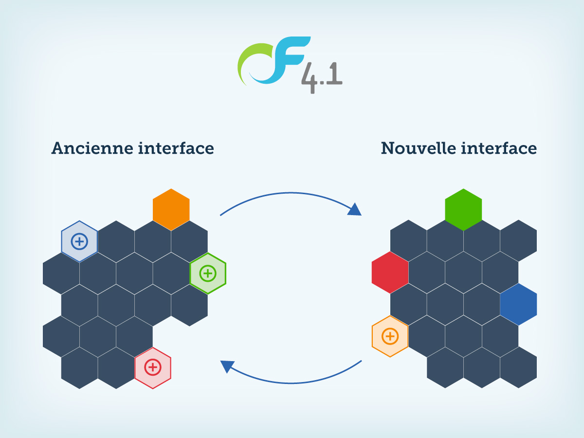
The arrival of version 4 has enabled OpenFlyers users to benefit from new features. Initially, these were not all developed on version 3. Conversely, some key features of version 3 did not find their equivalent on version 4. It is now done , through version 4.1. It also allows you to browse freely between the old interface (version 3) and the new interface (version 4) in order to have access to all of OpenFlyers.

For example, up to version 3, it was not possible to define the types of activities for reservations when this was possible for flights. On version 4.1, this limitation is no longer valid: OpenFlyers allows to define the activities freely as well for the flights as for the reservations.
In another order, one can evoke the color code of the booking schedule. On version 3, the colors assigned to the reservations depended on the type of people who booked. While on version 4, they were linked to activity types. With version 4.1, it is now possible, via the old interface, to set the colors for each activity:
https://openflyers.com/fr/doc/of4/Configuration#Code-couleur-sur-l'ancienne-interface
In addition, it is now possible, on the old interface of the schedule, to have the color code of the new interface.
In order not to disturb the structures that wish to keep the old color rule on the old interface, we have added a parameter that allows to define, at the level of the platform and for everyone the rule of display chosen for l old interface :
https://openflyers.com/fr/doc/of4/Gestion-des-types-d'activités#Affecter-une-couleur-à-un-type-d'activité
For the sake of homogeneity, the fusion of the functionalities is accompanied by a renaming of certain terms of the old interface. For example, menu titles initially adapted to flights have become generic. Today they can be used both for flights and for bookings. Thus the term "theft" is replaced by the term "activity". The "Flights" menu becomes the "Activities" menu, and the "Flight Management" menu item becomes "Activity Management".
Initially, we did not intend to make this renaming on the old interface because it had to disappear in favor of the new one. However, we have had feedback from users located in areas where high-speed broadband, via ADSL, or 4G, via cellular phones, let alone fiber, are not on the agenda. For these users, the digital divide remains a reality. These suffer from slow loading of the new interface. In fact, the latter is more difficult to download because it contains JavaScript code which makes it possible to dynamize the behavior of the pages and to make the user experience more practical. In other words, without a tongue of wood: the new interface "serious train" (as the younger ones would say) in the countryside. And the catch is that the airfields are not in the city center ...
That's why, from the beginnings of OpenFlyers, we've always favored lightweight pages. Thus, on version 1 of OpenFlyers, in 2003, at the time of ADSL modems in 512 KB / s, the instruction was that an HTML page should not make more than 50ko. Hence the clean design of the planning. We even pushed the vice until transmitting the lines without reservation in the form of large rectangles and dividing them into small rectangles of 15 minutes in width that once received by the navigator. This technique allowed us to gain valuable kilobytes of data to be transferred and this is what made OpenFlyers successful.
In order not to penalize these users, we have decided to maintain the old interface and even to evolve it in line with the new features of version 4. At the same time, we are continuing to apply the new ergonomics to still exist on the old interface.